For creatives, few moments are as disheartening as seeing a finished print where the vibrant cerulean blue on your screen has dulled to a muddy teal, or where a subtle sunset gradient appears as a stark band of color. This common frustration stems from a fundamental disconnect: every device in your workflow your camera, monitor, and printer interprets and displays color differently. The solution to achieving true, predictable color from screen to print isn’t guesswork; it’s a standardized system of translation built on ICC profiles.
The Core Problem: Why Colors Don’t Match
Imagine describing the color “crimson red” to three different translators who then must convey it to three different artists. Without a shared reference, the results will vary. Digitally, your monitor creates color with light (RGB), while your printer uses pigments or dyes (CMYK). Each device has its own unique color gamut, or range of colors it can produce. An ICC profile is the essential translator that bridges these gaps, ensuring “crimson red” means the same thing across the entire chain.

What Exactly is an ICC Profile?
An ICC (International Color Consortium) profile is a small data file that acts as a color passport for your image and a specification sheet for your devices.
- For Monitors and Printers: It precisely defines the color behavior and limitations (gamut) of that specific hardware.
- For Digital Images: It tags the file with information about which color “universe” it lives in (e.g., sRGB, Adobe RGB), so other devices know how to interpret its numbers correctly.
When your color-managed software (like Photoshop or Affinity) uses these profiles, it performs complex calculations to find the best possible match for a color from one device’s gamut to another’s, a process called color conversion.
The Color-Managed Workflow: From Screen to Print
Achieving accuracy requires linking these profiles together into a managed pipeline.
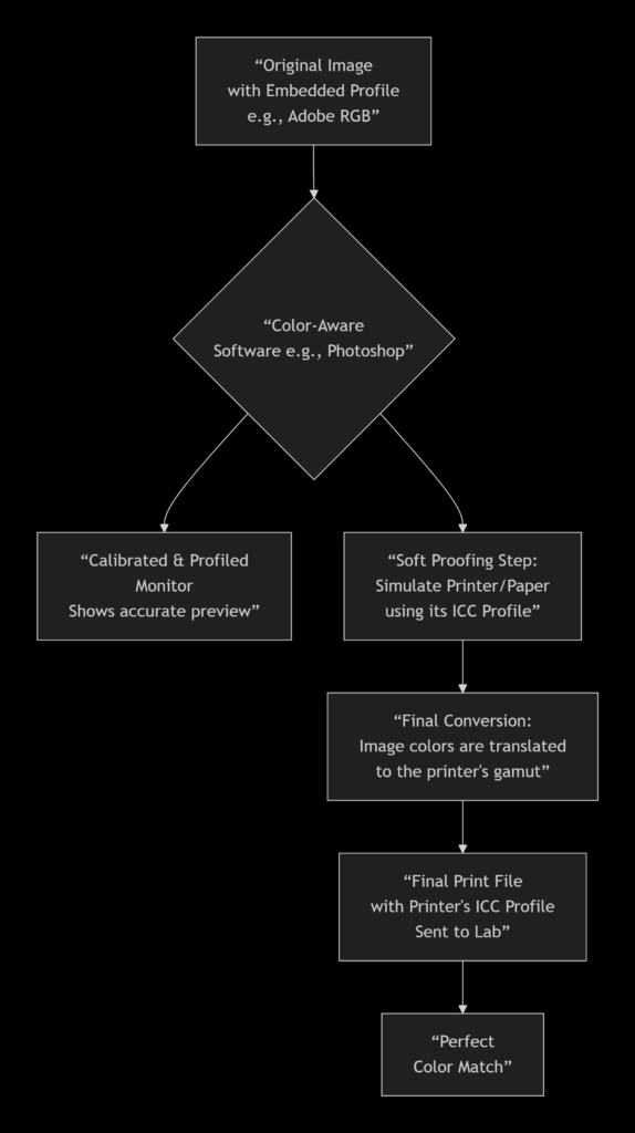
This visual workflow shows how a single image moves through a color-managed system. The critical stage is soft proofing, where you use the printer’s profile to preview on-screen how your image will look when printed, allowing for adjustments before any ink is used. The final step is the conversion, where your software remaps the image’s colors into the actual gamut of the target printer and paper.
The Different Types of ICC Profiles You Need to Know
| Profile Type | Purpose | Where You Get It & Why It Matters |
|---|---|---|
| Monitor Profile | Characterizes your screen’s color output. This is the foundation of accuracy. | Created using a hardware calibrator (e.g., X-Rite, Datacolor). Essential because an uncalibrated screen lies to you. |
| Working Space Profile (e.g., Adobe RGB, sRGB) | Defines the color gamut you edit within. Your digital canvas. | Chosen in your editing software. Adobe RGB is preferred for print due to its larger gamut. |
| Printer/Paper Profile | The most crucial for output. Defines the exact color gamut of a specific printer, ink, and paper combination. | Provided by your professional print lab. Using the correct one is non-negotiable for predictable results. |
A Practical Guide for Creatives: Your Action Plan
1. Calibrate Your Monitor: This is step zero. Invest in a basic calibration device. All other efforts are built on the assumption your screen shows true color.
2. Edit in a Suitable Color Space: For fine art printing, set your camera and editing software to Adobe RGB 1998 to harness a wider gamut of printable colors.
3. Request and Use Your Print Lab’s Profiles: A professional lab will provide ICC profiles for their printers and each paper stock they offer (e.g., “Brand_X_Printer_Enhanced_Matte.icc”). Download these and use them for soft proofing.
4. Master the Soft Proof in Photoshop:
- Go to View > Proof Setup > Custom.
- Under “Device to Simulate,” select your printer/paper profile.
- Check “Simulate Black Ink” for the most accurate preview. Toggle the proof view on/off (View > Proof Colors) to see the adjustment.
5. Convert and Export for Print:
- When saving your final file, use Edit > Convert to Profile.
- Set the “Destination Space” to your printer/paper profile.
- For the “Intent,” Perceptual is often best for photographs (preserves relationships between colors), while Relative Colorimetric is good for graphics (preserves exact in-gamut colors, clips others). Your lab can advise.
- Always embed the profile in the final TIFF or JPEG.
Partnering with Your Print Lab
A reputable fine art print service understands that ICC profiles are a shared language of quality. They should be eager to provide their custom profiles and guidance. When you send a file tagged with their specific profile, you’re not just sending an image; you’re sending precise instructions that their equipment can follow to reproduce your intent faithfully.
Embracing ICC profiles transforms color from a source of anxiety into one of absolute control. It replaces hopeful speculation with confident prediction, ensuring that the emotional impact of the color in your digital studio is delivered, intact, onto the surface of your final print.
Ready to print? Click here to being your next art print order